As a UX Architect, I established a new user experience practice within the B2B eCommerce team, with a clear focus on transparency and cross-functional collaboration. This initiative was designed to replace a previously siloed approach, which had led to fragmented communication and conflicting information—factors that were significantly impeding project success across the eCommerce team.
Initially I spent time with executive leadership and managers socializing the idea of setting the teams up for better collaboration. This included thinking around how project teams were assembled and resourced to physical working spaces. They weren’t convinced that we needed to do that much to improve the situation.
“An ounce of practice is worth more than tons of preaching.”
Mahatma Gandhi
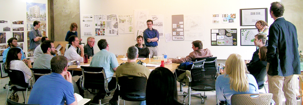
We decided to “proof” our ideas by brining small design sessions and workshops out in the open. Using sticky notes, magic whiteboard sheets, and making a mess looked fun to other colleagues in the organization. We also leveraged empty cubical walls in high traffic areas for sharing the results of our session’s ideas. Eventually, word spread to executive leadership that more people wanted to work the way we were working. Eventually this enabled us to create a dedicated collaboration space with a floor to ceiling whiteboard, a projector, and furniture for sitting and storing books. The space was open for anyone to anyone in the organization to use and became the hub for working through business problems and exploring ideas to solve them.
Our UX Method Creation
With our collaboration space set up there was no shortage of people wanting to use it. However, we wanted to have more structure to our approach. So, we began with thinking about how the organization typically operates and where it struggles. We met with our collaborators, both business and technical resources, and discussed the challenges on past projects.
We took the results of those meetings to the drawing board and began work on a framework that mapped to the flow of our current project life cycle. Our first attempt at diagraming our framework included too much detail, such as testing tools, build processes, etc. We found that it was too tedious to maintain all of that information in a single diagram and decided to keep the details focused to the information that was critical to collaborative understanding as related to project user needs, business goals, design definitions and keep the processes outside of core user experience with their respective owners.
Ultimately, we refined our End to End Method down to the visual representation (shown below). As things changed this was relatively easy to update and it provided a nice understand across the silos of how and when we connect.
At the same time the organization was defining project types; so, we worked the project types in as an overlay on our End to End UX Method diagram, mapping them to the appropriate PLC phases. Coupled with the light definition of each project type, this diagram help us all get on the same page with where each type should start and flow.
These diagrams helped organization tremendously by providing the framework as a starting point, but also by giving people permission to come out of their silos and work with each other.
You can reach out to me at jarrett.inge@gmail.com, if you’d like to discuss how to better integrate your creative design teams into your organization.